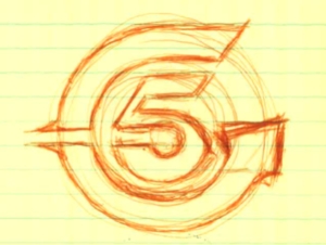
When my father and 4 others of his friends decided to start a new mold making company, they came up with the name Circle 5 given that there were 5 equal partners. They had to come up with a logo that expressed that. I remember seeing sketches of the logo on our kitchen table and decided to doodle as well.
The logo was a simple black and white with simple geometric features that to the Moldmaker’s eye, will trigger several thoughts. The first thought is that the top horizontal line would be created in steel by a wire cut EDM process or a combination of CNC milling and EDM burning. The EDM is required to produce a sharp corner. The bottom horizontal can simply be CNC machined with the cutters given the radius that exists. The logo was simple, and subtle but very telling to the Moldmaker’s eye.
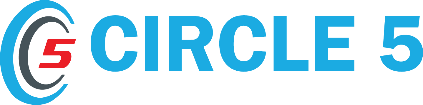
Fast forward to 2008 where we added color and depth. We also decided to change the font and add a slogan. The color chosen was something that matched our building. The slogan was very fitting. The word “Teamwork” precedes “Technology”. This is important because no matter what technology you may have, you will not be able to achieve without Teamwork.

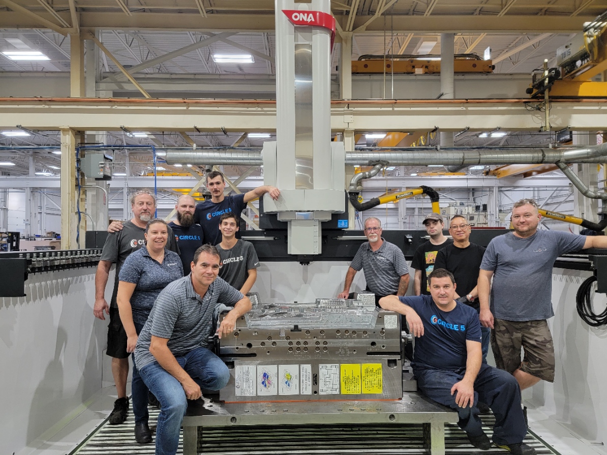
2022 brought a very different approach to our logo development. It wasn’t performed from the outside. Instead, we had our devoted team members provide ideas and have a stake in what our projection will be in our next chapters.
Some fantastic ideas that came from our staff are shown below.
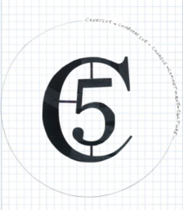
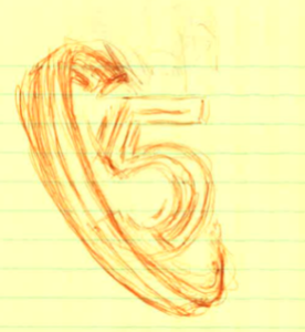
We sought to show dynamism, depth, evolution, and even a small play with negative space. “Tool & Mold” were dropped since that conjured up an image of a 20th-century factory. We changed our slogan as it better fits the energy and activity that exists at our company. We asked our Team Members to get creative (literally) on ideas, and finally, we came up with a logo that team members have ownership in.


Color Palette Evolution
As a collective, we are very proud of the logo we developed. It still maintains the roots of the original logo and more importantly, it was created by our very own team members.